

Dec 1, 2018
Why it’s Vital to Monitor the Health of your TM1 System
As the data volumes, computational complexity and user community of your TM1 applications grow over time, effectively monitoring the health of your system becomes vital to business continuity. And by “effective”, we don’t mean just in-the-moment, but over time.

Just like a doctor visit, your current weight blood pressure and other health metrics are important, but they must also be compared to a historical baseline in order to be truly meaningful. Sudden increases or decreases in weight provide much more information than what your weight is Right Now.
With TM1, these trends and comparisons could take the following forms:
- Is my application as responsive as it was before?
- Does my server take longer to restart or shutdown than before?
- Are alert events happening with increasing frequency?
- Is memory consumption increasing, in which cubes, and at what rate?
- Are the number and duration user sessions increasing or decreasing over time?
- Is the user experience better or worse than before?
- Do processes take longer to run?
- Are certain times of the day more problematic than others?
New in Cubewise Pulse: the System Summary Report
With the new System Summary Report introduced in the latest version of Cubewise Pulse (5.8), IBM TM1 and Planning Analytics administrators have a powerful tool to provide accurate answers to many of these questions. The System Summary Report gathers all key performance indicators such as user sessions, wait time and alerts in a concise one-pager PDF report.
Analysing the Number of Sessions vs Number of Alerts
One of the biggest system management benefits of Pulse is the ability to setup alert conditions for proactive monitoring of your TM1 applications. Pulse alerts can be defined for multiple scenarios, alert conditions and thresholds, including memory use, free disk space, user run time & wait time, TM1 crashes, error logs, message logs, rollback events and many others.
The first graph in the System Summary report displays the correlation between number of sessions vs the number of triggered alerts:
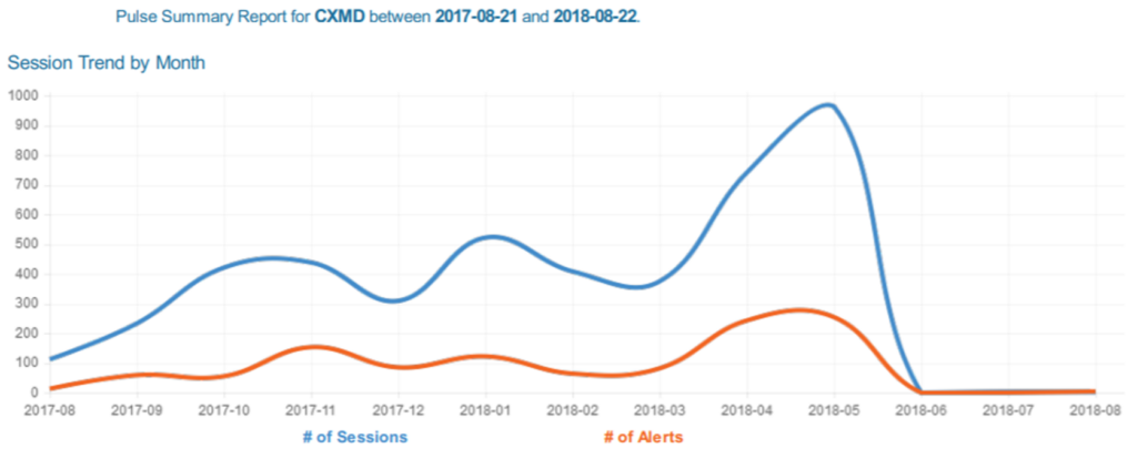
This chart allows you to examine cause-and-effect relationships such as:
- If the user sessions decrease over time
- If the number of alerts increase each time the number sessions increase
Analysing Wait Time
In the second section of the Report, administrators will see the Top 10 waiting time event, their duration, and a bar chart to analyse the maximum wait time by period.
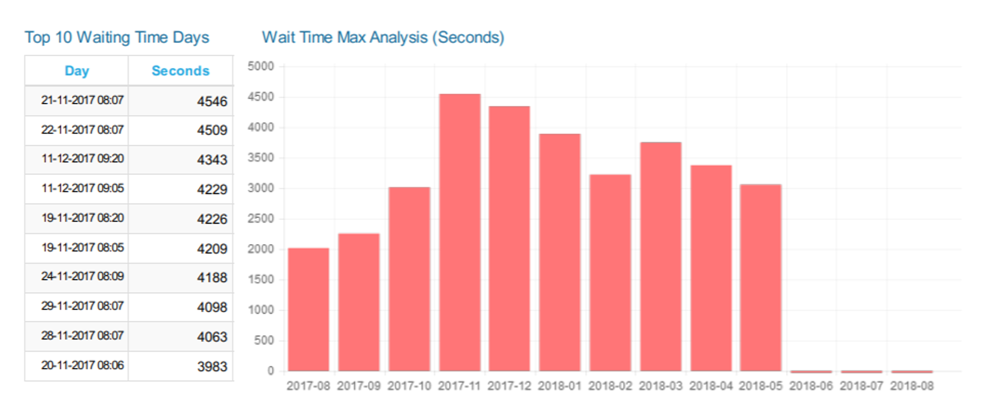
Things to consider in this chart:
- If the wait time is greater than 60 seconds during working hours
- If the maximum wait time per period increases
Analysing Alerts
The last chart displays the distribution of alerts by type over time:
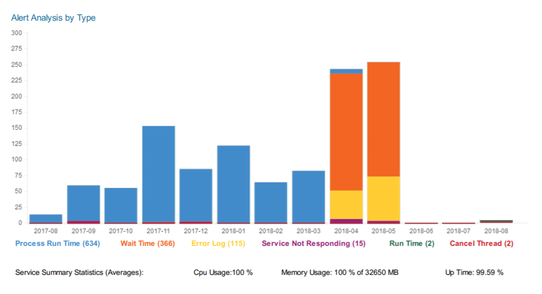
Things to monitor:
- If the volume of alerts are increasing
- If the distribution of the alert types are changing
Automatic Bursting
To make it easy to end this report to your team at pre-defined intervals, Pulse provides a scheduler. For example, you could distribute this report on a weekly basis that includes the last seven days of data.
More information about the Pulse system summary report can be found in the Help article: