

- Why using Python for Data Science?
- Objective
- Prerequisites
- Step 1: Load, visualize 2017 monthly bike shares by city
- Step1 – Video
- Step 1 – Conclusion
- Step 2: Explore seasonal and regional trends
- Step 2 – Video
- Step 2 – Conclusion
- Step 3: Analyze relationship between average temperature and bike shares by day
- Step 3 – video
- Step 3 – Conclusion
- Step 4: Analyze the impact of Non-working days vs. Working days.
- Step 4 – video
- Step 4 – Conclusion
- Next step: Timeseries forecasting
May 5, 2018
Explore your TM1/Planning Analytics data with Pandas and Ploty

Welcome to the second part of the Data Science with TM1/Planning Analytics article. In the Part 1 article, we uploaded in our TM1 cubes the weather data from a web service. Now that we have all the data we need in TM1, we can start to analyse it. The Python community provides lots of tools which make data science easy and fun.

Why using Python for Data Science?
- Top-notch, free data analysis libraries.
- Free (and good) libraries to access data from systems or web.
- Lots of research in new disciplines like, Machine Learning (Tensorflow) or Natural Language Processing (NLTK).
- TM1 (as the Information Warehouse) is the ideal data source for Data Science
Before going through this article, you should read first, Part 1:
Objective
The objective of this article is to explore the impact of seasonal effects, weather and public holidays on our operative business. To do that we are going to follow these steps:
- Load and visualize monthly bike shares by city
- Explore seasonal and regional trends
- Analyze relationship between average temperatures and bike shares by day
- Analyze the impact of Non-working days vs. Working days.
We created a Jupyter notebook to guide you through these steps. The notebook that we are going to use in this article is Data Science with TM1py.ipynb, you can find it in the cubike-sample.zip file which you can download in the Part 1 article.
Prerequisites
To run this example on your machine, you will have to make sure first that you have installed the following components:
- Windows C++ compilers Installation and Configuration
- Pandas provides high-performance and easy-to-use data structures.
- Numpy introduces (fast) vector based data types into python.
- SciPy scientific computing in python (e.g. Linear Regression).
- Matplotlib is a plotting library.
- ploty a charting library to make interactive, publication-quality graphs online.
- PyStan on Windows required for Prophet.
- Prophet is a tool for producing high quality forecasts for time series data.
- TM1py the python package for TM1.
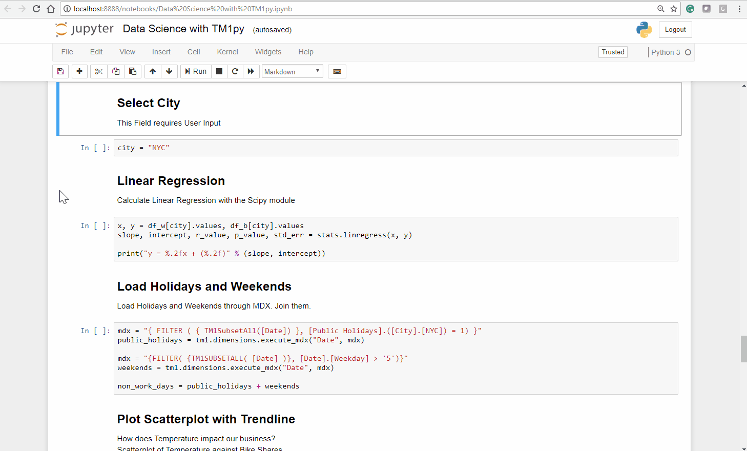
Step 1: Load, visualize 2017 monthly bike shares by city
The first step is to define the TM1 connection settings which you find at the top of the notebook:
ADDRESS = "localhost"PORT = 8009USER = "admin"PWD = ""SSL = True
Before we start with the analysis, we first need to bring data from TM1 into our notebook.
We start with data from the view 2017 Counts by Month of the Bike Shares cube.
To load data from the cube view into python we execute the following code:
cube_name = 'Bike Shares'view_name = '2017 Counts by Month'data = tm1.cubes.cells.execute_view(cube_name=cube_name, view_name=view_name, private=False)
Our cellset, given back by TM1, is stored in the variable data. We use a TM1py function to convert the cellset into a pandas dataframe, which we call df:
df = Utils.build_pandas_dataframe_from_cellset(data, multiindex=False)
We now need to rearrange the dataframe. We need to reduce the dimensionality of our data from 4 (Time, Version, City, Measure) to 2 (Time, City). This should make our life easier down the road.
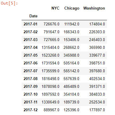
df['Values'] = df["Values"].replace(np.NaN, 0)for city in ('NYC', 'Chicago', 'Washington'): df[city] = df.apply(lambda row: row["Values"] if row["City"] == city else None, axis=1)df.drop(columns=["Values"], inplace=True)df = df.groupby("Date").sum()To show the rearranged dataframe, we can just type df into a jupyter cell and execute it.
Let’s plot a barchart from our dataframe, to explore and understand the monthly distributions throughout the cities, visually.
Using the popular charting library Plotly, we can create an interactive barplot with just 7 lines of python code:
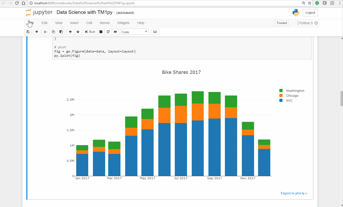
cities = ('NYC', 'Chicago', 'Washington')# define Data for plotdata = [go.Bar(x=df.index, y=df[city].values, name=city) for city in cities]# define Layout. stack vs. group !layout = go.Layout( barmode='stack', title="Bike Shares 2017")# plotfig = go.Figure(data=data, layout=layout)py.iplot(fig)As you can see below the Ploty package creates an interactive bar chart, you can untick a city and zoom into a specific chart area:
Step1 – Video
Step 1 – Conclusion
As expected, the seasons have a massive impact on our bike sharing business. In the warmer months we have substantially more usage than in colder months.
Also interesting is that the seasons seem to impact cities differently. While the relation between Summer and Winter months in NYC and Washington DC is approximately 1/2, in Chicago it is close to 1/5!
Let’s dig deeper into the relationships between the cities and the Temperature!
Step 2: Explore seasonal and regional trends
In order to get a clearer picture, instead of just looking at monthly figures of 2017, we are going to bring in the daily data from 2014 to 2017.
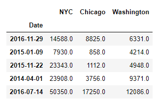
We execute the following code to create a new dataframe df_b based on the data coming from the view 2014 to 2017 Counts by Day:
cube_name = 'Bike Shares'view_name = '2014 to 2017 Counts by Day'data = tm1.cubes.cells.execute_view(cube_name=cube_name, view_name=view_name, private=False)df_b = Utils.build_pandas_dataframe_from_cellset(data, multiindex=False)df_b['Values'] = df_b["Values"].replace(np.NaN, 0)# Rearrange content in DataFramefor city in ('NYC', 'Chicago', 'Washington'): df_b[city] = df_b.apply(lambda row: row["Values"] if row["City"] == city else None, axis=1)df_b.drop(columns=["Values"], inplace=True)df_b = df_b.groupby("Date").sum()Let’s print 5 sample records from the dataframe using df_b.sample(5):
Pandas dataframes come with very handy and easy to use tools for data analysis. To calculate the correlation between the different columns (cities) in our dataframe, we can just call the corr function on our dataframe. df_b.corr():
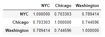
As one would expect, the bike shares by day across our three cities are all strongly correlated.
To analyze the relationship between the average temperature and the bike shares by city, we need to query the daily historic average temperatures from our TM1 cube into python.
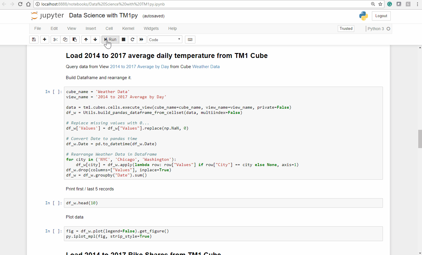
We execute the following code to create a dataframe (we call it: df_w) based on the cubeview 2014 to 2017 Average by Day of the Weather Data cube:
cube_name = 'Weather Data'view_name = '2014 to 2017 Average by Day'data = tm1.cubes.cells.execute_view(cube_name=cube_name, view_name=view_name, private=False)df_w = Utils.build_pandas_dataframe_from_cellset(data, multiindex=False)
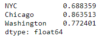
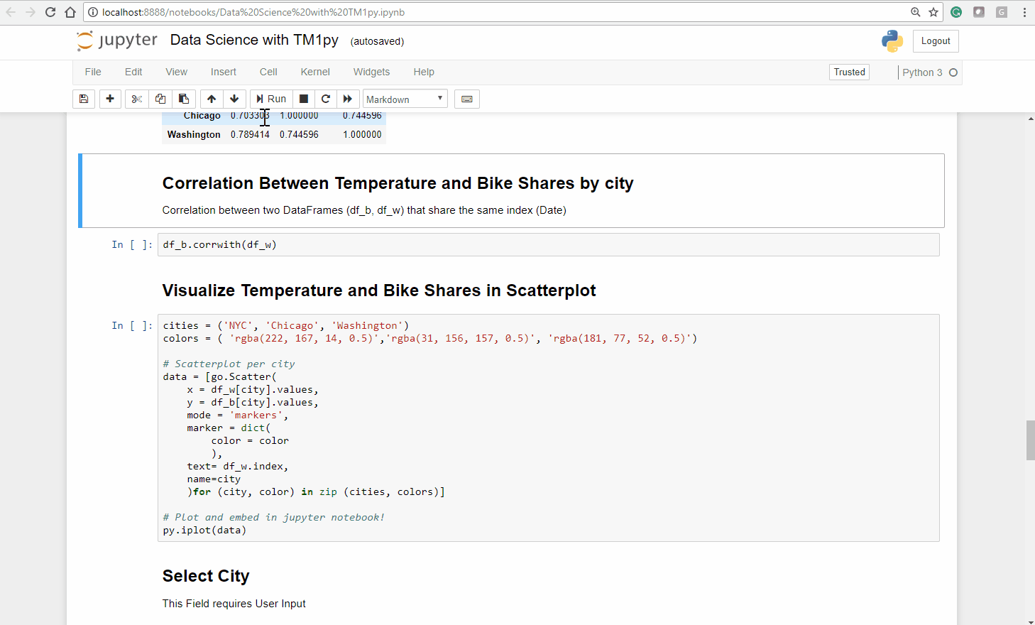
To calculate the correlation between the two dataframes (df_w and df_b) we can use the corrwith function
df_b.corrwith(df_w)
Step 2 – Video
Step 2 – Conclusion
Temperature and Bike shares are strongly correlated in every city.
For the forecasting (part 3 of this series) to be effective we will need a model that can take seasonal effects (e.g. temperature) into account.
The intensity with which temperature affects the bike shares varies by city.
For the forecasting we will need to create different models by city.
Step 3: Analyze relationship between average temperature and bike shares by day
Let’s visualize the relationship between temperature and bike shares in a Scatterplot.
From our two dataframes: df_w (average temperature by day) and df_b (bike shares per day) we can create a scatterplot in just a few lines of code:
cities = ('NYC', 'Chicago', 'Washington')colors = ( 'rgba(222, 167, 14, 0.5)','rgba(31, 156, 157, 0.5)', 'rgba(181, 77, 52, 0.5)')# Scatterplot per citydata = [go.Scatter( x = df_w[city].values, y = df_b[city].values, mode = 'markers', marker = dict( color = color ), text= df_w.index, name=city )for (city, color) in zip (cities, colors)]# Plot and embed in jupyter notebook!py.iplot(data)Step 3 – video
Step 3 – Conclusion
Analyzing the plot visually we make a few statements:
- Among the three cities, the distribution in Chicago is the closest to a linear model .
Judging visually, we could draw a neat line through that point cloud - For Washington DC we can recognize an interseting trend, that for temperatures of approx. 25 degrees and higher the bike count stagnates.
- The distribution for NYC is less homogeneous. A simple linear model would not sufficiently explain the bike shares count.
Let’s quantify those finding and take a closer look at the how non-working days impact our operative business.
Step 4: Analyze the impact of Non-working days vs. Working days.
To analyze the impact of Public holidays and weekends, we will focus on one city at a time. Let’s start with NYC.
First we want to create a linear regression between the average temperatures and the bike shares for NYC.
To calculate the fitted line we use the linregress function from the popular Scipy stats module.
Note that the function not only returns us the slope and intercept of the fitted line, but also three measures (R squared, P Value and the Standard Error), that quantify how well the fitted line matches the observations.
x, y = df_w[city].values, df_b[city].valuesslope, intercept, r_value, p_value, std_err = stats.linregress(x, y)
Now we need to query Public Holidays and Weekends from TM1 through two small MDX Queries, and merge them into a list. This list we call non_work_days.
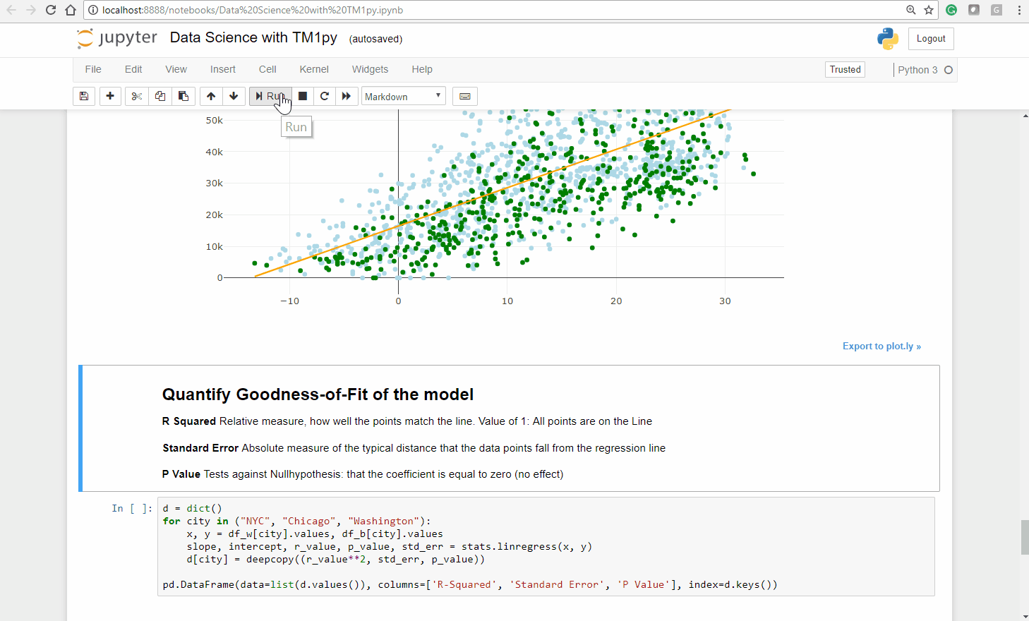
mdx = "{ FILTER ( { TM1SubsetAll([Date]) }, [Public Holidays].([City].[NYC]) = 1) }"public_holidays = tm1.dimensions.execute_mdx("Date", mdx)mdx = "{FILTER( {TM1SUBSETALL( [Date] )}, [Date].[Weekday] > '5')}"weekends = tm1.dimensions.execute_mdx("Date", mdx)non_work_days = public_holidays + weekendsNow we can create a new scatterplot, that includes the fitted line (orange), the working days (blue) and the non-working days (green).
When we repeat this exercise for Chicago and Washington DC we see a similar picture:
The fitted line matches the points more (Chicago, Washington DC) or less (NYC) good and the majority of the green points lay underneath the fitted line.
Step 4 – video
Step 4 – Conclusion
In all three cities the vast majority of the green points lay under the fitted line.
On Non-working days there is generally less usage than our fitted linear regression model (Temperature ~ Bike Count) predicts.
For the forecasting (part 3 of this series) to be effective we will need to take weekdays and public holidays into account.
Next step: Timeseries forecasting
The last part of this series is about timeseries forecasting with TM1py. We are going to use Prophet to forecast the bike shares in the future: